3줄 요약
- shy-eyesmile 헤더의 포즈·구도·얼굴·표정에 mucha-paisley-tricolor의 오리지널 연출 프롬프트를 입혀 만든 합성 카드. 두 개의 정본을 한 화폭에 합쳐 새 카드를 빚는 카드 간 교배 실험이었다.
- 무샤 트리컬러 합성 → 머리카락 fine-line engraving → papercraft 다층 다이오라마 → 네온 우회 → 크림슨 복귀 → 1536x2304 high 정본 업스케일. 단계마다 시안 3종을 1024x1536 / low로 후보 스캔.
- 크림슨이 사라지니 매력이 죽었다는 사용자의 한 마디가 결정적이었다. 키컬러 변경과 입체화를 함께 시도한 papercut 단계에서 색을 잃었고, 네온 우회로 매력을 한 번 되찾고서야 입체화만 적용하고 팔레트는 유지라는 정답을 찾았다.
의도와 시드
이번 작업은 카드 간 교배라는 새로운 시도였다. 사용자가 직접 두 갤러리 카드를 가리키며 결합 방식을 명시했다.
포즈와 구도, 얼굴, 표정은 shy-eyesmile 헤더 사용. 연출 지정은 mucha-paisley-tricolor 포스팅의 오리지널 프롬프트 사용.
시드는 갤러리 정본 서소영 (실사).png. 정체성 시드는 처음부터 끝까지 동일하게 유지됐고, 단계마다 직전 단계의 결과물이 visual master로 추가되어 multi-input edit로 굴렸다.
1단계 · 무샤 트리컬러 합성
shy-eyesmile cover를 visual master로 받고, 무샤 프롬프트의 near-profile 지정만 제거(헤더 포즈는 3/4 view + peek-through라 정면 쪽)했다. 트리컬러(crimson·black·ivory + gold), 페이즐리 헤어, 무샤 아치, 아르누보 의상 결만 가져왔다.
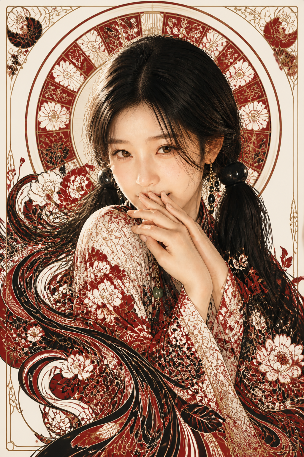
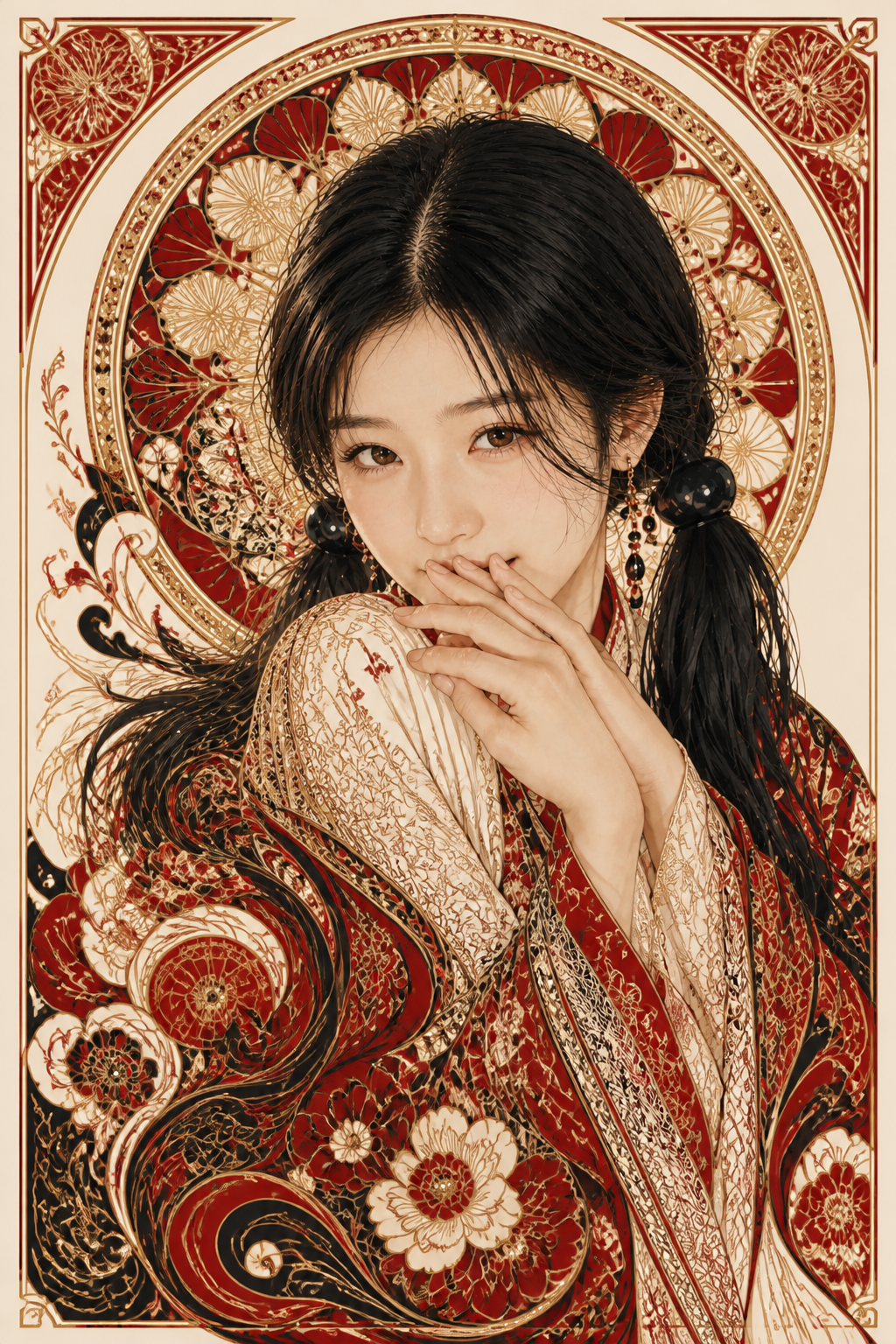

세 장 모두 무샤 포스터 결과 shy-eyesmile peek-through가 한 화폭에 들어왔다. 사용자는 v2를 다음 단계의 베이스로 선택했다 — 표정과 시선이 가장 또렷이 살아 있어, 카드의 인물로서 가장 잘 식별되는 결이었다.
2단계 · 머리카락 fine-line engraving
v2 기반으로 한 가지 변경 — 머리카락을 수십 가닥의 선묘가 물결치는 동판화 결로 변환하고, 그 가닥들이 의상·프레임 장식으로 녹아들게.
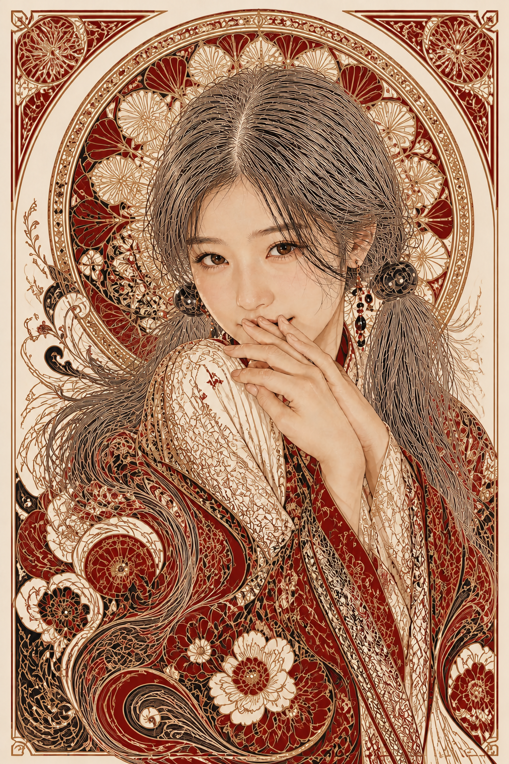
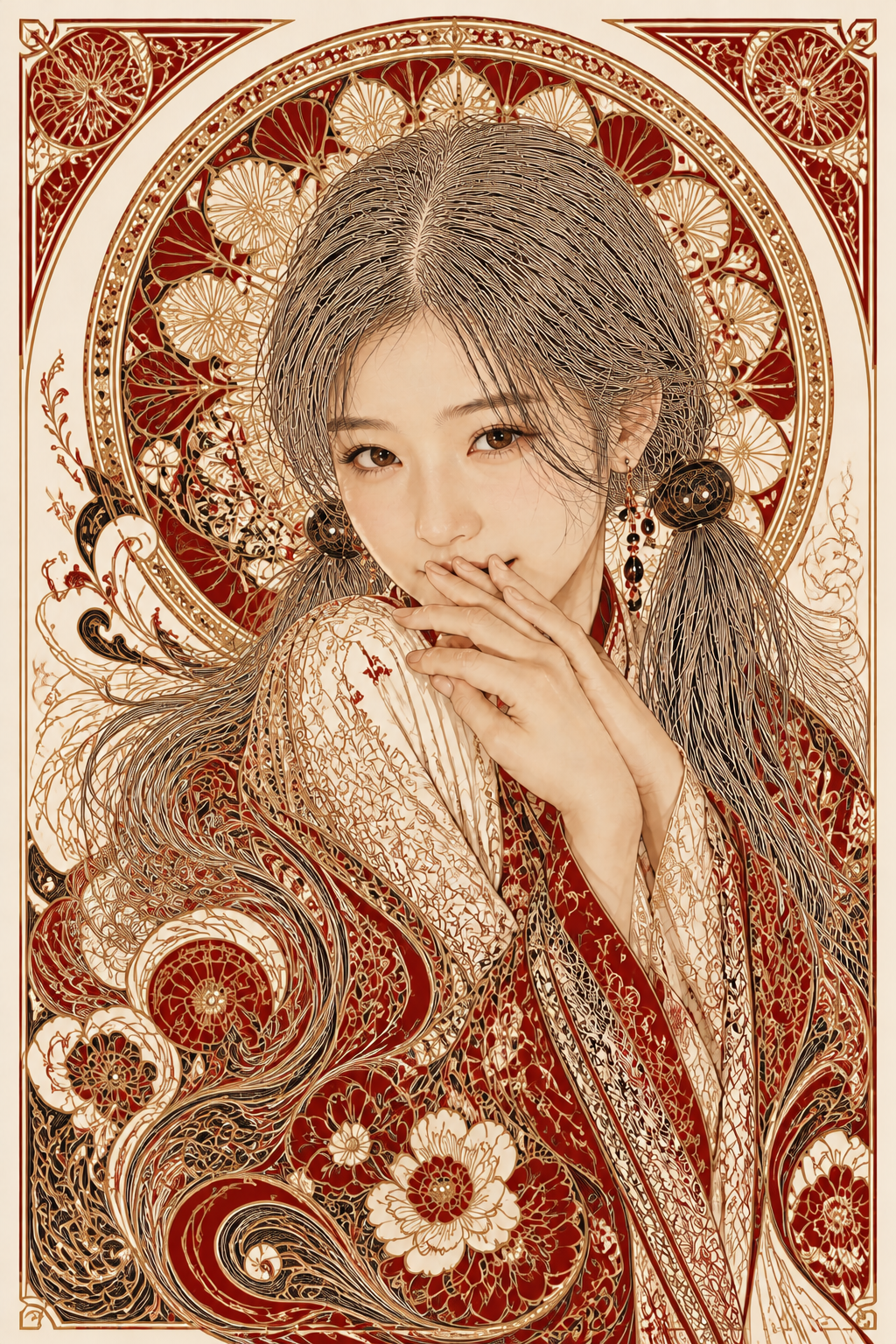
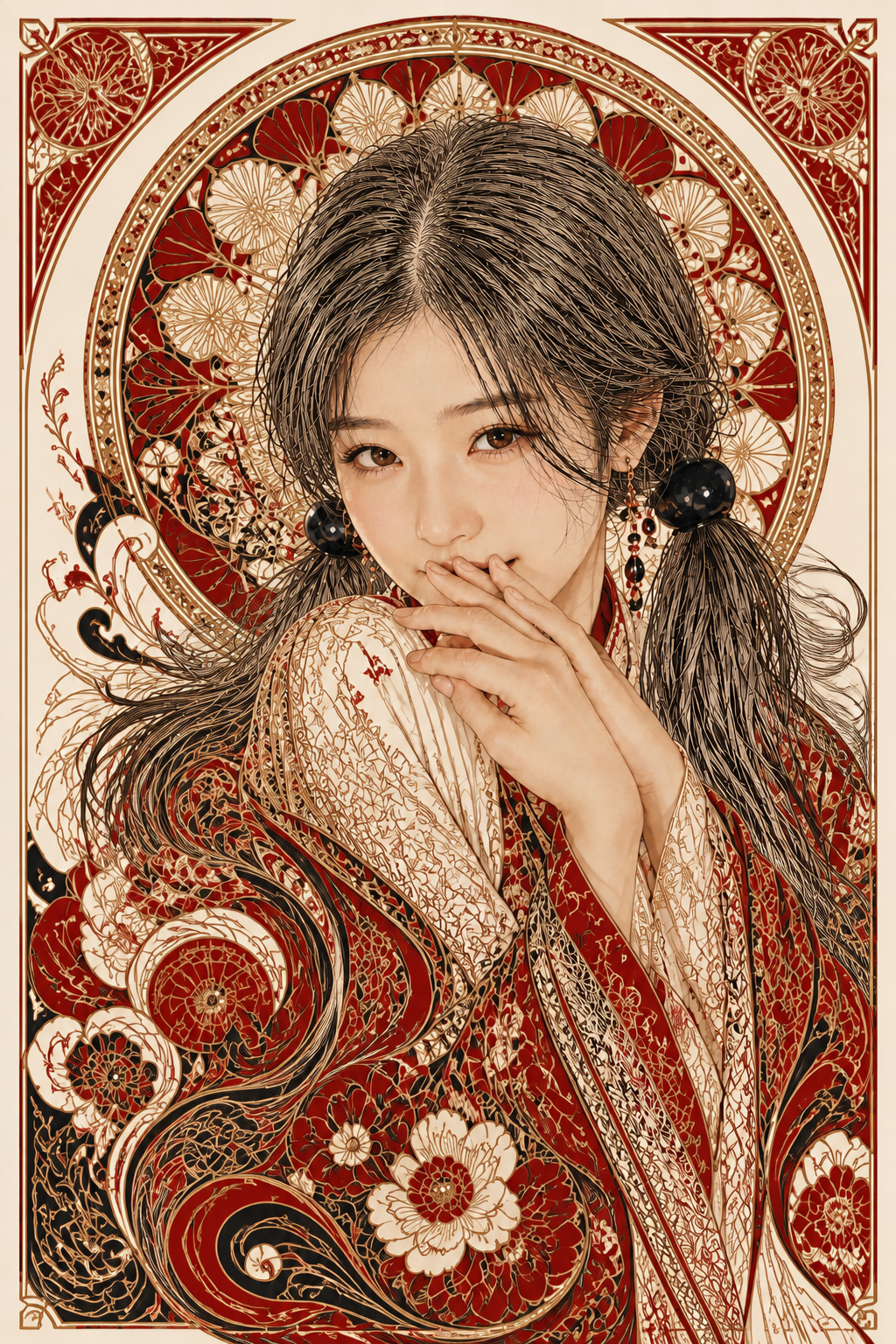
머리카락 한 가닥 한 가닥이 분리되어 보이는 동판화 결이 세 장 모두 들어왔다. 어깨 아래에서 의상의 페이즐리·모란으로 녹아드는 흐름까지 잡혔다. 사용자는 v3를 다음 단계 베이스로 선택 — 머리인지 장식인지 모르겠다는 본래 의도가 가장 극적으로 실현된 결이었다.
3단계 · papercraft 입체화 + 키컬러 변경
여기서 두 가지를 동시에 시도한 것이 패착이었다. (1) 만다라·페이즐리·모란을 종이 공예 다층 레이어로 입체화. (2) 팔레트를 아이보리 + 검정 + 골드로 갈아끼우고 크림슨을 검정으로 흡수.
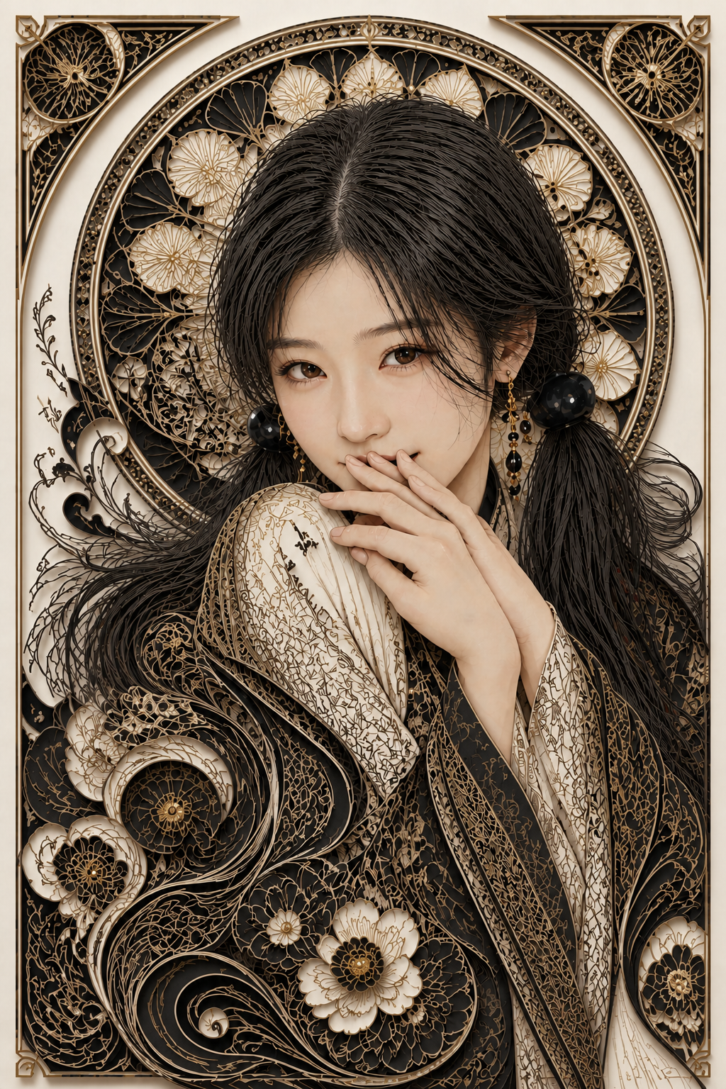
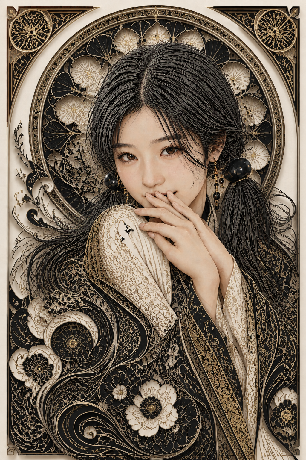
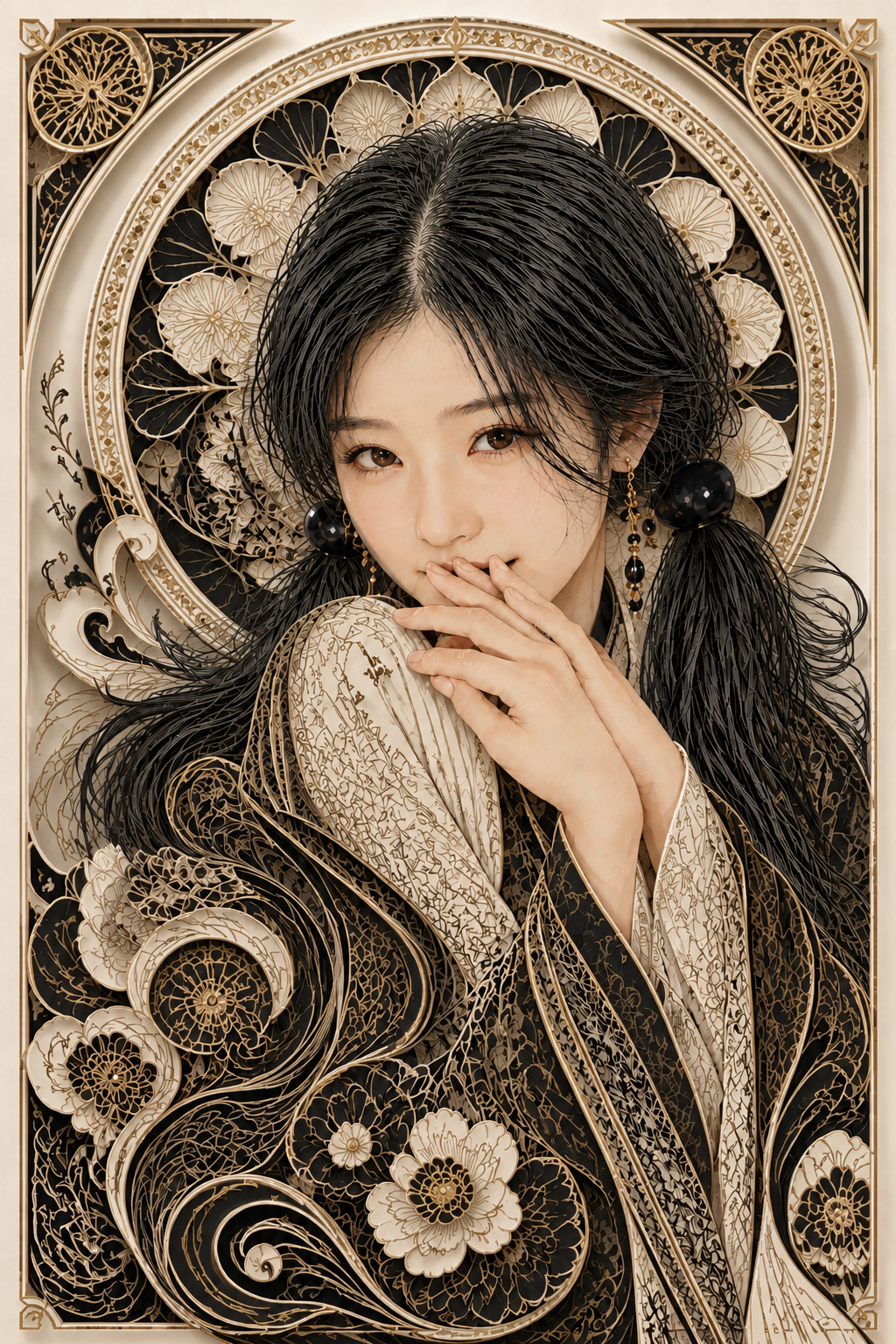
papercraft 입체감은 잘 들어왔지만 크림슨이 사라지니 매력이 죽었다. 사용자의 한 마디가 결정적이었다.
크림슨이 아니니 좀 매력이 죽네.
두 변경을 한 번에 시도한 죄였다. 그러나 그대로 되돌리지 않고 우회 변주를 한 번 더 거치기로 했다 — 색을 잃은 자리에 다른 매력을 채워 넣는 시도.
4단계 · 네온 우회
papercut v3 기반으로 팔레트를 네온 핑크·시안·초록·보라로 갈아끼웠다. 단 한 장만 굴린 우회 변주.
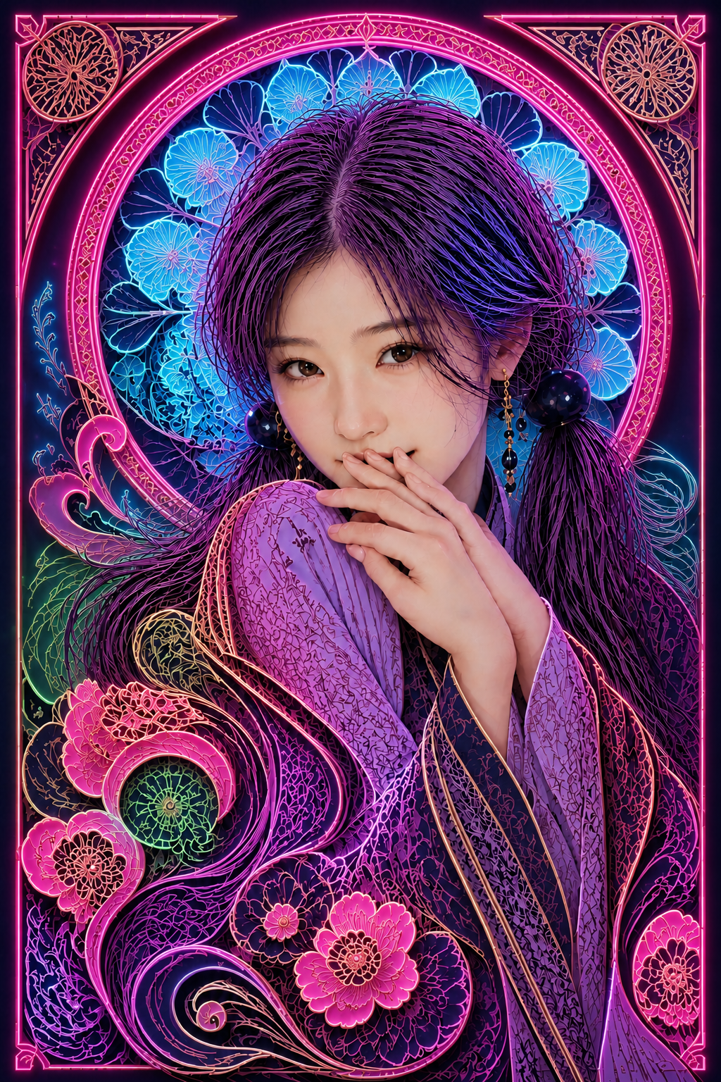
매력은 돌아왔다. 핫핑크 마젠타 outer arch, 시안 halo, 보라 의상이 네온 색종이 결로 발광 직전 상태로 떨어졌다. 사용자는 한 걸음 더 — 조도를 낮추고, 진짜 발광·블룸·헤일레이션을 입히고, 채도는 약간 다운, 클럽 대기감을 요청했다.
5단계 · 네온 글로우 + 클럽 대기감
네온 v0를 visual master로 두고, 진짜 광원으로서의 네온과 공기 두께가 있는 클럽 대기를 입혔다.
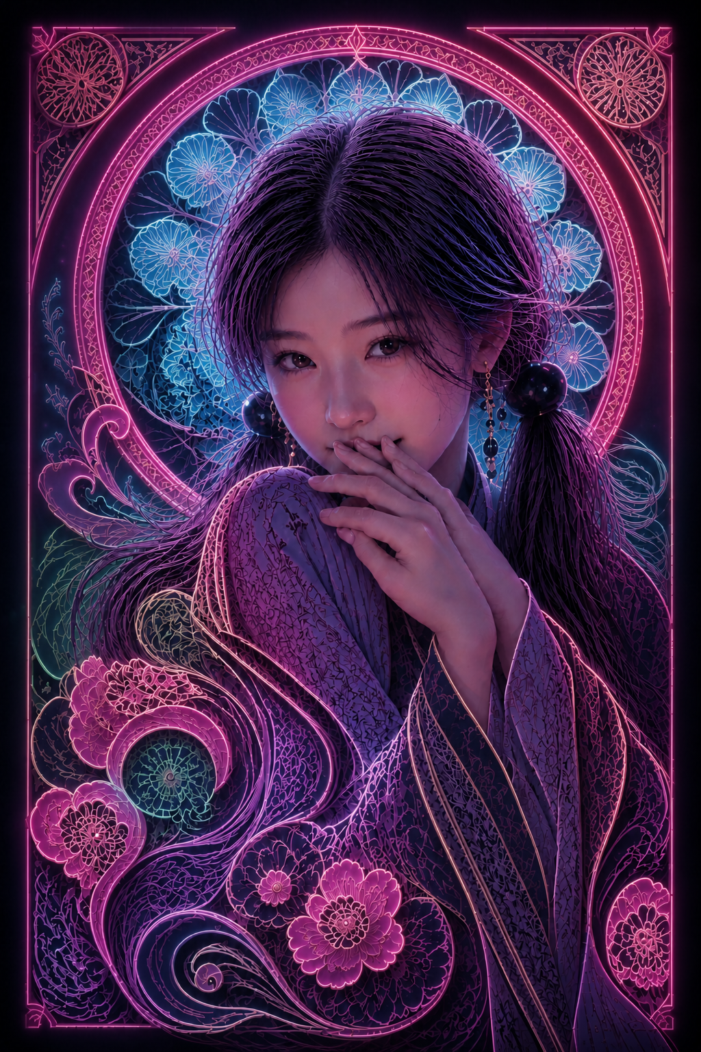
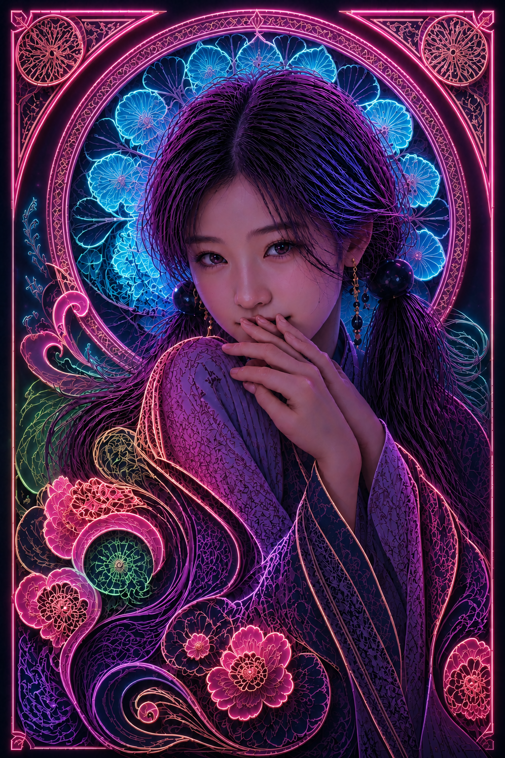
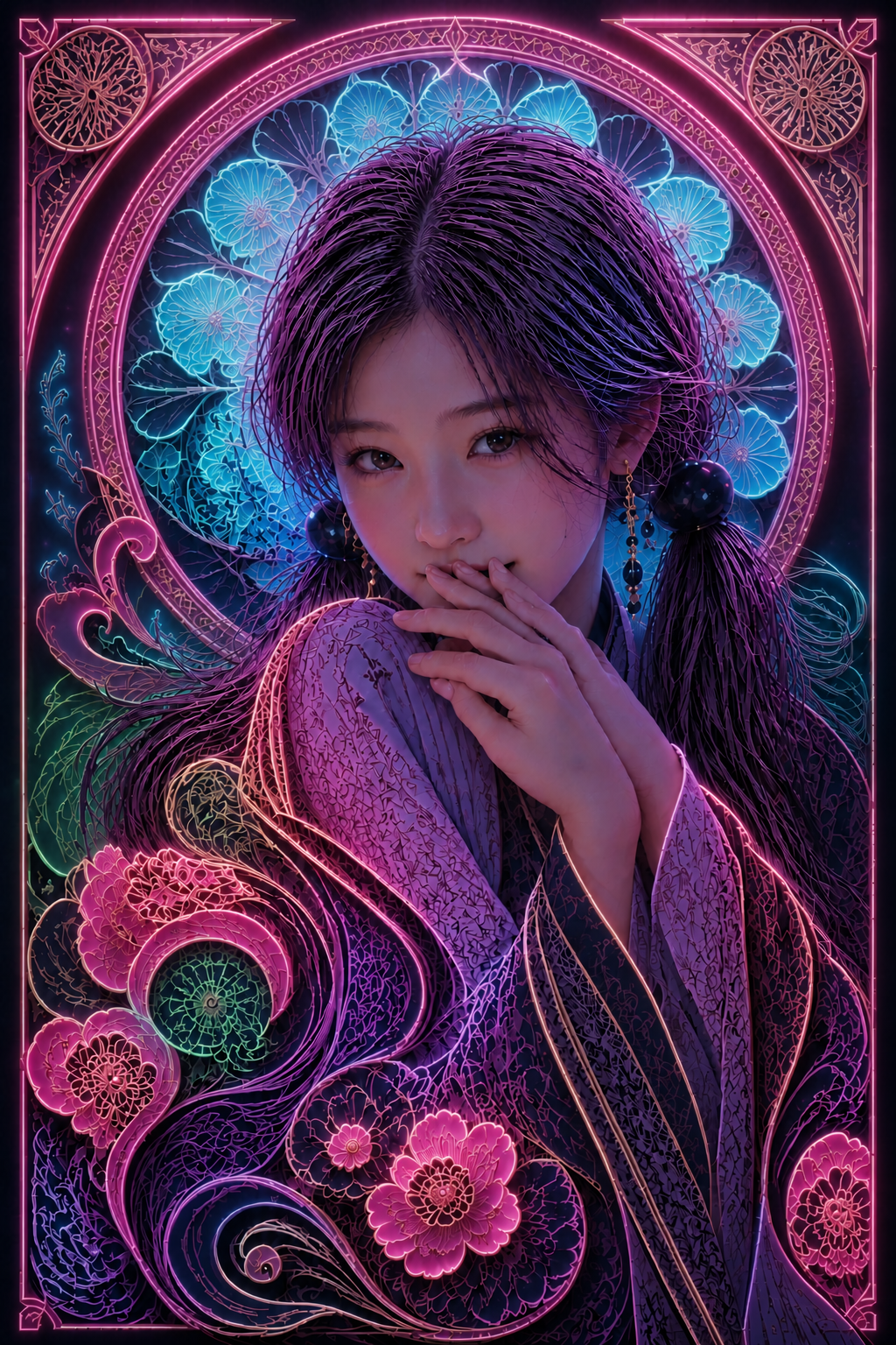
bloom·halation·채도 다운·클럽 대기감 모두 들어왔다. 1980년대 홍콩 골목 네온 사진의 결이 살아났다. 그러나 사용자의 다음 한 마디가 결정적이었다.
흥미롭긴 한데 좀 아쉽네. 크림슨의 v3로 다시 돌아가자.
네온은 매력이 있었지만 카드의 결은 아니었다. 무샤 트리컬러라는 본래 토대로 돌아가되, 입체화만 가져오는 길이 정답이었다.
6단계 · 크림슨 복귀 + papercraft만 적용
hairflow v3로 회귀. 이번에는 키컬러는 그대로 두고 종이 공예 입체화만 적용했다. 두 변경을 한 번에 시도하지 않고, 하나만 분리했다.
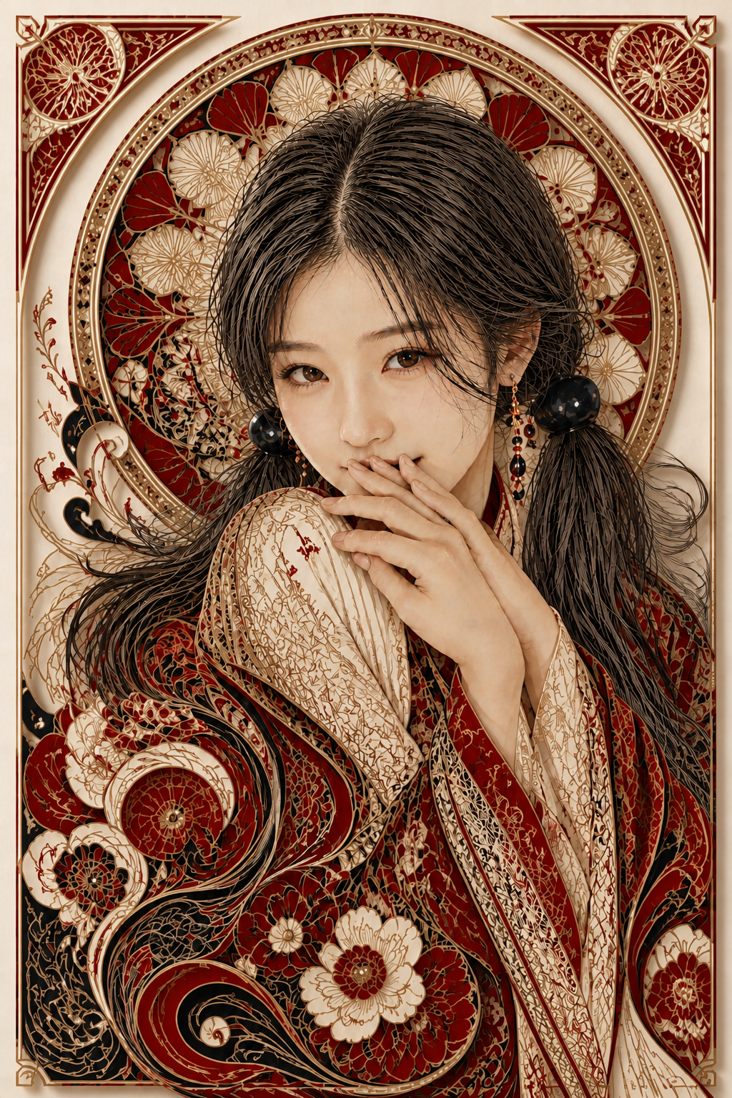
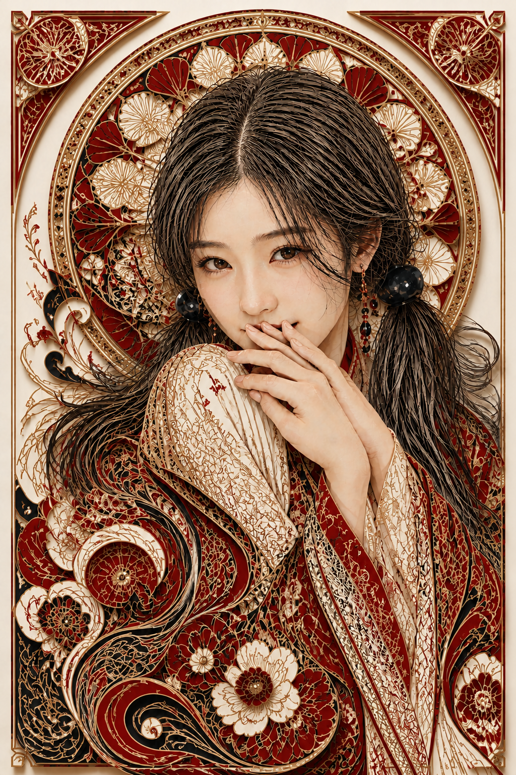
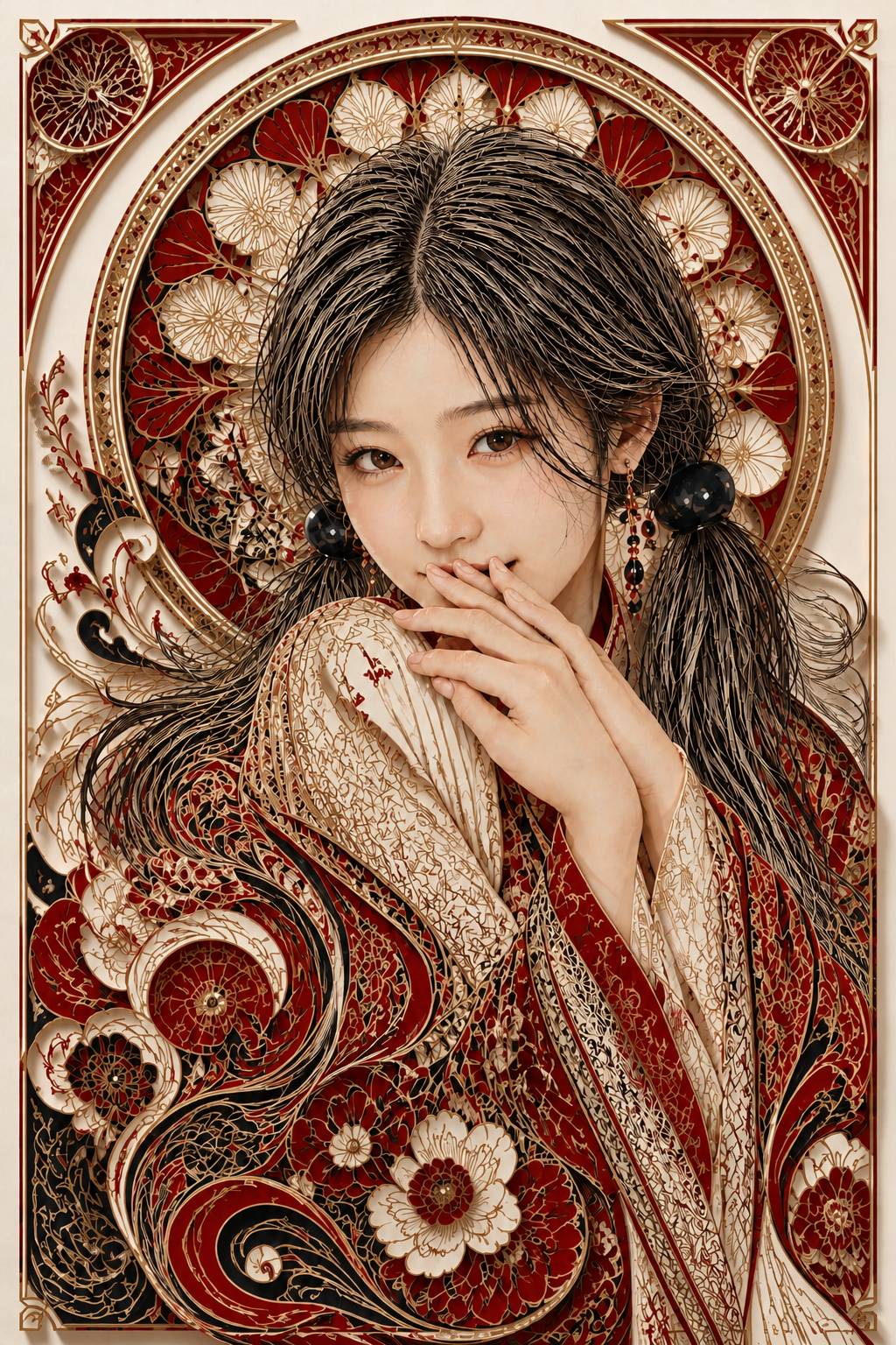
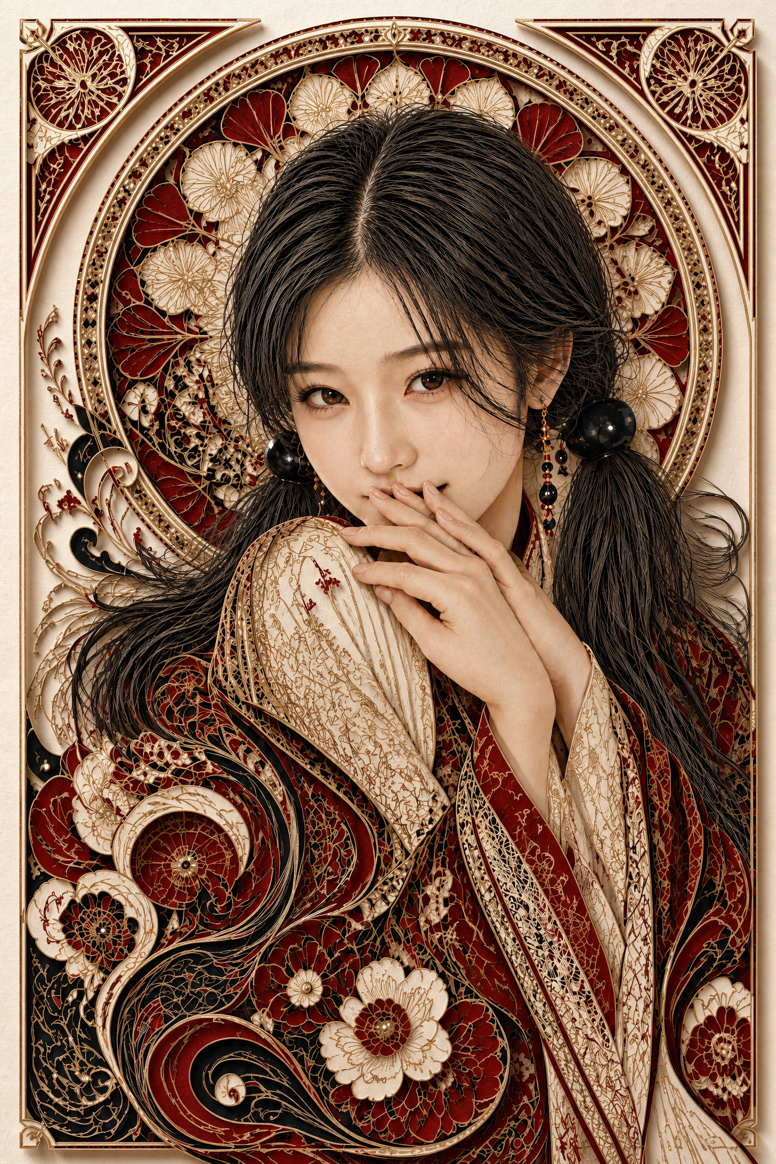
크림슨이 살아 돌아오면서 매력이 함께 돌아왔고, 동시에 종이 공예 입체감이 들어와 셋 다 가졌다. 사용자는 v1을 정본 후보로 선택. 후광 만다라의 정교한 워시 종이 결, 의상의 종이 꽃송이 같은 입체 모란, 그리고 단정한 우아함이 다음 단계의 마스터로 적합했다.
7단계 · 1536x2304 / quality=high 정본 업스케일
v1을 visual master로 두고 quality=high로 한 번 더 굴렸다. 구도·자세·표정·팔레트·종이 레이어는 1:1로 보존하면서 디테일만 끌어올리는 패스. 호출 시간 약 3분 30초, 8.3MB. 결과물은:
- 종이 시트 표면의 워시·한지 섬유결이 정밀하게 살아남
- 모란 종이 한 장 한 장의 집어 들 수 있을 듯한 입체 깊이
- 페이즐리 컬의 cut-edge가 razor-thin으로 정돈
- 머리카락 가닥이 한 가닥씩 분리되어 보이는 fine-line engraving 결
- 의상 레이스 자수의 미세 cut 디테일
- 후광 만다라의 필리그리 linework가 정밀해짐
- 골드 leaf의 hammered 미세 텍스처
이게 본 카드의 커버다.
가장 흥미로운 지점
두 카드의 교배. shy-eyesmile은 서소영의 인물 카드, mucha-paisley-tricolor는 연출 카드. 정체성이 다른 두 정본을 한 화폭에 합쳐 새 카드를 빚는 시도였다. 인물 카드의 포즈·표정·구도·정체성과 연출 카드의 팔레트·배경 장식·아르누보 결을 명확히 분리해 각자 무엇을 가져올지 정의하니, 한 장의 multi-input edit으로 합성이 가능했다. 카드 간 교배라는 새 패턴이 열린 셈이다.
변경은 한 번에 하나씩. 3단계 papercut에서 입체화와 팔레트 변경을 동시에 시도한 것이 패착이었다. 입체화 자체는 잘 들어왔지만 색이 사라지면서 카드의 매력도 함께 사라졌다. 사용자가 한 마디로 짚어준 뒤 입체화만 떼어내고 팔레트는 유지한 6단계가 정답이었다. 모델 변경은 한 번에 하나의 축만 움직인다는 원칙이 다시 한 번 확인됐다.
우회 변주의 가치. 4·5단계의 네온 우회는 결과적으로 카드의 결은 아니었지만, 그 과정에서 색을 잃은 자리에 다른 매력을 채워 넣을 수 있다는 가능성이 확인됐다. 네온이 매력적이었기에 그 결을 그대로 가지고 갈 뻔했지만, 사용자는 흥미롭긴 한데 좀 아쉽네라는 한 마디로 카드의 정체성을 일관되게 끌고 갔다. 우회 변주는 직진했다면 보지 못했을 카드의 결이 아닌 결을 식별하게 해준다.
multi-input 위계의 안정성. shy-eyesmile의 6단계에서 이미 확립된 시드 + visual master 위계가 본 작업의 모든 단계를 일관되게 지탱했다. 한 단계의 결과를 다음 단계의 visual master로 인계하는 파이프라인은 시안에서 정본으로 넘어갈 때의 핵심 도구이며, 카드 간 교배 같은 새로운 시도에서도 그대로 작동했다 — 시드(서소영 정체성) + 직전 단계 마스터(누적된 모든 변경)의 두 입력으로 한 단계씩 변경을 쌓아가는 방식이 안정적이었다.
프롬프트
본 카드의 정체성을 결정한 7단계 업스케일 프롬프트 전문.
High-resolution polished version of the reference scene. Hyper-detailed editorial portrait in the form of an Alphonse Mucha Art Nouveau poster, reimagined as a multi-layer paper-cut diorama. Vertical Art Nouveau poster composition, theatrical framing, ultra-fine detail, 8k.

You receive TWO reference images:
- IMAGE 1 (identity reference): the female subject. Preserve her face identity EXACTLY — East Asian features, eye shape, brow shape, nose, lip shape, skin tone, and her hairstyle as in this seed.
- IMAGE 2 (visual master): treat this image as the visual master. Preserve the EXACT composition, framing, head tilt, hand position with fingertips at lips peek-through, shoulders, eye-smile expression, sidelong gaze, faint blush, wardrobe silhouette, pose, Mucha arch, halo, peony, paisley, filigree motifs, fine-line engraved hair strands, motif arrangement, palette, AND multi-layer paper-cut diorama construction of IMAGE 2. This is a high-resolution refinement of IMAGE 2 — same image, more detail.

PALETTE — preserve IMAGE 2 unchanged:
- Strict tri-color palette of IMAGE 2: deep crimson red, jet black, ivory white, with delicate gold leaf accents only. No palette change.
- All red regions stay crimson; all black regions stay jet black; all ivory regions stay ivory white; gold accents remain delicate gold linework.

CONSTRUCTION — preserve IMAGE 2 unchanged:
- Multi-layer paper-cut diorama: each ornamental motif (Mucha arch, halo emblem, filigree borders, paisley scrolls, peony blossoms, ornamental curls) sits as a separate hand-cut paper sheet stacked at slightly different depths.
- Depth ordering: filigree borders and outer arch frame at the very front; portrait and engraved hair in the central depth; halo emblem, peony, paisley fields layered behind her; ivory background as the deepest back wall.
- Soft directional ambient light from upper-left casting subtle layered shadows tinted warm dark crimson-brown from each paper sheet onto the layer behind.
- Cut edges crisp and razor-thin.

REFINEMENT TARGETS — improve over IMAGE 2:
- Paper texture: visible fibrous handmade washi / hanji grain on every sheet, more pronounced and elegant, never glossy.
- Cut edges: even cleaner, with the precision of a hand-cut paper artwork — every micro-jag eliminated, every clean cut crisp.
- Layered shadows: more refined soft falloff between layers, slightly deeper at the cut-edge, fading smoothly into the back layer. The illusion of physical millimeter gaps between sheets must be unmistakable.
- Gold leaf accents: more refined metallic highlight detail, with subtle hammered-leaf micro-texture, catching the warm light precisely.
- Engraved hair strands: more individual hairline strands visible, each crisp and tapered, jet black with occasional crimson and gold accents, flowing outward and dissolving naturally into the surrounding paper ornament.
- Face: more refined porcelain skin micro-texture, sharper iris detail with cleaner catchlights, more lifelike lip detail and faint blush.
- Wardrobe: clearer lace and floral patterning on the paper-cut wardrobe sheets, finer cuts revealing more intricate detail.
- Peony blossoms: more layered petal cuts with clearer paper-craft depth, more refined gold-leaf veining on the petals.
- Mucha arch and halo emblem: sharper filigree linework, more precise ornamental detail, cleaner mandala patterning inside the halo disc.
- Paisley scrolls: more elegant flowing curves, finer cut detail in the swirling motifs.

CAMERA — preserve IMAGE 2:
- Straight-on view of an exhibition-grade paper-cut diorama, with shallow depth-of-field bias on the layered shadows.
- Background remains clean ivory white (slightly aged paper tone), preserving IMAGE 2's bright background.

Everything else (face identity, pose, hands, expression, wardrobe silhouette, motif arrangement, color, crop) must remain identical to IMAGE 2.

Strict tri-color palette as in IMAGE 2: deep crimson red, jet black, ivory white, delicate gold leaf accents only. No other colors. No text, no extra characters.